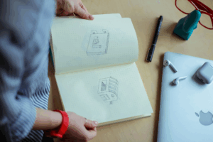
When you think about great icons, the first words that come to mind are usually simple, clear, and easy to recognise. That’s not an accident. The best icons are designed with a few timeless principles in mind, and following these can make the difference between an icon set that feels professional and one that frustrates users.
These principles aren’t random “rules of thumb”, they’re grounded in psychology, usability research, and years of design practice.
The five essential rules of icon design guide the creation of visuals that are clear, consistent, and highly effective. These principles ensure icons are instantly recognizable, scalable across devices, balanced in proportion, and visually appealing. Following them enhances usability, guides users seamlessly, and strengthens brand identity across all interfaces.
A good icon should deliver meaning at a glance. The more details you add, the harder it becomes for users to decode what it means. Simple icons reduce cognitive load and are faster to recognize, as supported by Hick’s Law. For example, a plain trash bin symbol is instantly understood as “delete,” while a detailed illustration of a garbage bag with shading and textures can be confusing at small sizes. Start with the essential shape if you can remove a line and the icon still makes sense, it’s better without it.
Users rarely see just one icon they interact with sets on toolbars, navigation bars, or app menus. If one icon looks different, it stands out and breaks trust. Key elements to keep consistent across an icon family include stroke width, corner radius, fill style, and grid alignment. A set where one icon has thick lines and another thin feels messy, while a consistent set looks polished and trustworthy. Consistency is backed by Gestalt psychology, which explains why people naturally group similar visuals together.
An icon fails if users have to stop and guess its meaning. Clarity relies on familiar, universal symbols, such as a magnifying glass for search, a pencil for edit, or a heart for favorite. Overly abstract or “creative” shapes may appear appealing to designers but confuse users. Clear icons ensure immediate recognition and seamless interaction.
Icons appear everywhere, from smartwatch screens to 4K displays, and must scale without losing meaning. Tiny details often disappear at small sizes, like 12px, so strong silhouettes and minimal fine lines are essential. Best practice involves testing icons at multiple sizes 16px, 24px, 48px, and 64px to ensure the design remains effective and recognizable across devices.
Even a simple icon can feel off if it lacks balance. Symmetry and proportion make icons appear stable and visually pleasing. Poor balance might show as a slightly tilted circle or a shape that feels heavier on one side. To fix this, align elements to a grid, use symmetry whenever possible, and maintain equal spacing between parts of the icon. Properly balanced icons improve both aesthetics and usability.
While graphics and visual style make icons attractive, their real value lies in functionality. Icons are not just small graphics, they are signposts that guide users. A beautifully drawn icon that people don’t understand is nothing but useless. That’s why functionality is more important. The most effective icons work across cultures, fit the context they’re used in, remain accessible to all users, and sometimes even come alive with motion to reinforce their meaning. Let’s look at these functional aspects more closely.
Icons are powerful because they cut through language barriers and save users the effort of reading text. However, this only works if users instantly recognize what the icon represents. Research in usability testing shows that users spend just 50–100 milliseconds scanning an icon before deciding if it makes sense (Nielsen Norman Group). That means clarity isn’t optional, it’s critical.
Examples of universally recognized icons:
Designers who stray from these conventions in favour of “fresh” symbols often hurt usability. For example, replacing a search magnifier with a compass might feel creative, but most users won’t understand it instantly.
Even universally acknowledged icons can mislead if they don’t fit the context. A shopping cart makes excellent sense in an e-commerce app, but it could be confusing in a project leadership tool. Context gives icons their true meaning. This is why testing icons inside the actual product flow is essential. An icon that works well on a white BG in Figma may look completely different in a busy interface. The best icons always blend easily into their surroundings, feeling natural and right at home wherever they’re used.
Accessibility makes icons more inclusive and functional in real-world use:
An icon isn’t truly functional until it’s accessible to all.
Icons shouldn’t be just static on the screen. A little movement can go a long way in making them more engaging and intuitive. Just imagine a heart icon that easily fills with color when you tap it, it rapidly makes the action feel more extraordinary. Motion and interaction enhance the meaning and usability of an icon.
Aesthetics in icon design are far from decoration, they influence how users emotionally connect with a product. Studies in visual cognition show people make judgments about design credibility in under 50 milliseconds (Nielsen Norman Group). That means the “look” of an icon isn’t secondary, it’s part of first impressions. An icon that feels off-brand or poorly drawn can make a product appear rushed, while a clean, balanced set builds trust and signals professionalism.
Well-designed icons combine clarity with beauty. They follow principles of style, color, balance, and symbolic precision so they feel like natural extensions of the product’s personality.
Consistency in style creates visual balance. A mismatched icon can break the flow of an interface. For example, WhatsApp and its icons share the same stroke weight and rounded edges, creating a consistent interface. Contrast this with early 2000s apps, where skeuomorphic, flat, and outline icons were mixed, resulting in visual noise.
Practical checks for consistency:
Apple’s HIG puts it well: “Icons should share the same visual language, so they feel like part of the same family.”
Colors carry strong emotional weight and guide user decisions. For example, red signals show emergency or danger, green shows success or safety, and blue conveys belief, which is why it dominates platforms like Facebook and LinkedIn. Yellow attracts attention & awareness but can mean energy or caution depending on context.
Designers should also consider culture, red, for example, signals a warning in the West but prosperity in China. The best practice is to use color intentionally, keeping palettes simple and reserving bold hues for important actions, as recommended in Google’s Material Design.
Negative space gives icons clarity and balance. Overfilled shapes may look fine at large sizes, but become unreadable when scaled down to 16px or 24px. To make an ideal icon, designers often rely on grids like Google’s 24×24 system and test icons at multiple resolutions to ensure they remain crisp and functional in real-world interfaces.
When text enters iconography, simplicity is key. The “Aa” symbol for text settings works because it uses basic sans-serif forms. Decorative fonts would collapse at small sizes.
For example, the “ℹ️” info icon is universally understood because it combines typography with a standardized visual symbol.
Icons may appear tiny, but their impact is huge. They influence how we navigate apps, recognize brands, and communicate meaning across cultures. A well-designed icon can save a user thousands of seconds, spark trust in a brand, or make an interface feel effortless. On the flip side, a confusing or cluttered icon can frustrate people and send the wrong message. Let’s explore how icons work in practice, where they shine, where they fail, and what designers should keep in mind.
Just think about how much you usually use a magnifying glass icon to search for anything, or when you want to open the settings, you use the gear, or when you want to delete something, you start finding the dustbin. You don’t even have to read the text; it’s an instant recognition. That’s the magic of icons in the user interface, they actually reduce the friction.
Research by the Nielsen Norman Group found that pairing clear icons with short labels helps users complete tasks about 20% faster. It’s not about reinventing the wheel, it’s about making common actions smooth and predictable.
A few things good UI icons always have in common:
If logos are the face of a brand, icons are the voice that carries across platforms. The Twitter bird, Apple’s bitten apple, Nike’s swoosh, they’re instantly recognizable, even without words. That’s the power of icons in branding. In marketing, icons usually:
Here’s where things get tricky, not every icon means the same thing everywhere.
This is why global brands test icons across cultures just like they test copy. Airbnb, for example, runs semiotic research before rolling out icons internationally. A culturally aware icon set avoids misunderstandings and connects with audiences on a deeper level.
AI is shaking things up in design, and icons are no exception. Tools like MidJourney or Figma’s generative plugins can spit out dozens of concepts in seconds. That’s incredibly powerful for brainstorming, you can ask for “minimalist travel icons” or “3D food icons” and get instant variety.
But here’s the catch: AI often struggles with detail. An icon that looks great at 512px can turn into a blurry mess at 24px. Tiny misalignments or odd proportions become glaring. That’s why, for now, AI is best used as an idea generator, not a final production tool.
The exciting part? Platforms like Adobe Firefly are already training models specifically for vector work. We’re not far from AI icons that are sharper and more usable straight out of the box.
Here’s the truth no matter how clean, clever, or polished your icon looks, it doesn’t matter if people don’t get it. Designers often fall in love with their own work, but icons live and die in the hands of users.
Quick ways to test:
A Baymard Institute study found that adding small labels under icons improved task success rates by 22% on e-commerce sites. That’s a huge win from such a tiny adjustment.
Bottom line? Don’t trust your gut alone. Even seasoned designers misjudge how an icon will land. Test early, test often, and let your users be the final judge.
The best icons don’t just look good, they are purposeful, intuitive, and psychologically sound. A well-designed icon belongs to a coherent system, strengthens brand identity, supports quick decision-making, and works effectively at small sizes. Although icons may seem minimal, designing them well is a true UX skill. With clarity, consistency, and context, icons become powerful tools that guide, support, and enhance the overall user experience. Explore nowicon for quality icons to use in your next project.
Premium Subscription

 1.5 million icons in format PNG 1.5 million icons in format SVG Royalty-free, commercial licenses Unlimited downloads Unlimited Collections Unlimited use of the editor Copy to clipboard No Ads Download history Priority support
Everything you need. One Premium plan.
 Unlimited PNG & SVG downloadsNo attribution, full commercial licenseUnlimited collections & pack downloads
Billed yearly ($50) · Save 50%
Billed monthly · cancel anytime
Create a free account or log in to unlock additional free downloads, save collections, and access your download history.
Continue downloading free PNG iconsSave icons to collectionsKeep your download history No attribution required
Premium-quality icons in a wide range — PNG and SVG format
Unlimited downloads
Unlimited use of the icon editor
Create Unlimited collections
Priority Support
No attribution required
Downloads Premium-quality - PNG and SVG format
Unlimited downloads
Unlimited use of the Icon editor
Create Unlimited collections
Priority support


