
These days, almost every website has some kind of social media presence. Platforms change quickly, with new apps appearing and older ones updating their look and features all the time. Social media has become such a big part of daily life that most of us can recognize its icons instantly.
They may only take up a few pixels, but social media icons are far above. These familiar little symbols instantly connect people to a brand’s online presence, serving as much more than decorative elements. These icons are shortcuts to trust. They reassure visitors that they don’t just see a logo on a page, but a real presence they can connect with in the spaces they already spend their time.
When brands follow official standards, they don’t just avoid legal issues, they also strengthen recognition, maintain consistency across platforms, and build trust at every touchpoint where users encounter their identity.
At their core, social media icons are standardized graphical symbols that represent specific platforms and serve as interactive gateways. For example, the bold red play button immediately points to YouTube, while the iconic blue “f” universally represents Facebook.
But these icons aren’t just visual cues. Instead of typing “Find us on LinkedIn,” a visitor to a university website can simply drop by the small “in” icon in its footer. One click takes visitors straight to the school’s official page. It’s quick, obvious, and feels second nature to anyone browsing.
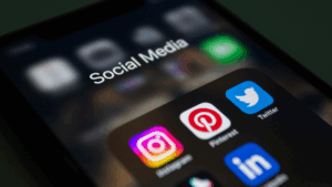
Here are the most used social media icons:
Icons play a powerful role in shaping brand perception. Their presence tells people: This business is accessible, modern, and transparent.
In short, icons don’t just link to platforms, they reinforce a brand’s presence, reliability, and relevance in the eyes of its audience.
Every major social platform provides its own set of brand guidelines to make sure its icons are used consistently and correctly. These rules outline details like clear space, minimum sizes, acceptable colors, and when to use glyphs versus app icons.
Take Instagram, for instance: the platform requires you to download its glyph artwork directly from its official Brand Resource Center. The glyph must always maintain clear space equal to at least half of its size and can not be used smaller than 29×29 pixels.
Following these rules isn’t about being restrictive, it’s about preserving recognizability, clarity, and professionalism.
Instagram
Use only the official glyph, never the app icon. Maintain a clear space equal to half the glyph size, and never go below 29×29 pixels. Variants in black, white, or multicolor are acceptable as long as they remain unaltered.
The lowercase “f” mark must keep its proportions and spacing. It can appear in blue or white, with the white version recommended for dark backgrounds. Distorting, rotating, or recoloring it is prohibited.
The logo must only be in the official blue or white, surrounded by clear space equal to 150% of its width. It must not be smaller than 16px, and outdated or altered versions should never be used. (Recently, the icon of Twitter has been changed from a bird to an X)
Adding social media icons isn’t just about dropping them on a page. They should link to verified accounts, match your brand’s look, and be in formats that stay sharp on any screen. Done right, they make your brand feel trustworthy and professional.
But if they do poorly, they can create confusion, visitors, or even create legal issues if brand rules are not followed.
Icons should always link to verified, active accounts rather than placeholder or inactive profiles. Verified accounts with a proper checkmark reinforce authenticity and trust, especially for business and public figures. For example, a restaurant website footer is linked with its Facebook icon to an outdated or unofficial page, then customers might lose trust. Instead, linking directly to the verified Facebook or Instagram profile ensures customers connect with the correct source, boosting credibility and encouraging genuine engagement.
Consistency is key when using icons across platforms. Keep your icons uniform in shape, size, color, as well as placement across all the different brand materials. For instance, if your website, email and apps, if your site use circular Instagram and LinkedIn icons, avoid switching to square or gradient-heavy ones in your newsletter; small inconsistencies like that can feel jarring. Staying consistent with a strong brand identity creates a smooth, recognizable experience for users wherever they interact with you.
The file type you choose affects how your icons look. SVGs are best for websites because they stay sharp at any size, making them perfect for responsive layouts. PNGs work well for emails and mobile apps since they’re supported almost everywhere and still look crisp.
For instance, a SaaS company may use SVG icons in its web header or footer for pixel-perfect scaling while using PNGs in the newsletter to make sure that they will render correctly across all devices.
Social media icons aren’t just symbols, they’re trademarked logos. Each platform has its own rules for how it should look. Changing the color, shape, or using an old version can break those rules. For example, turning YouTube’s red play button into another color could misrepresent the brand and even cause legal trouble. The safest option is to download icons from the official brand center and use them exactly as provided.
Using social media icons the wrong way is not just a design mistake, it can actually get you into trouble. Platforms have strict rules, and breaking them could mean your content gets taken down, your account suspended, or even your app rejected.
Sticking to the right sources keeps your design professional and your brand out of trouble.
Social media icons might look simple, but they are playing a very important role in branding and communication. When used correctly, they will enhance trust, improve navigation, and strengthen the brand identity. By following different brand rules, keeping the design consistent, and ensuring they are easy to see and click, these little visuals become more than just decoration and transform themselves from a visual to a powerful tool. The right icon doesn’t just decorate, it engages, connects, and reinforces professionalism across all digital and offline touchpoints. Explore nowicon for quality icons to use in your next project.
Premium Subscription

 1.5 million icons in format PNG 1.5 million icons in format SVG Royalty-free, commercial licenses Unlimited downloads Unlimited Collections Unlimited use of the editor Copy to clipboard No Ads Download history Priority support
 No attribution required1.5M icons download in SVG, PNGUnlimited downloadsMultiple SizesCustomize Stroke SizeOutline to FillBrowse ad-free
 No attribution required
1.5M icons download in SVG, PNG
Unlimited downloads
Browse ad-free
No attribution required
1.5M icons download in SVG, PNG
Unlimited downloads
Browse ad-free